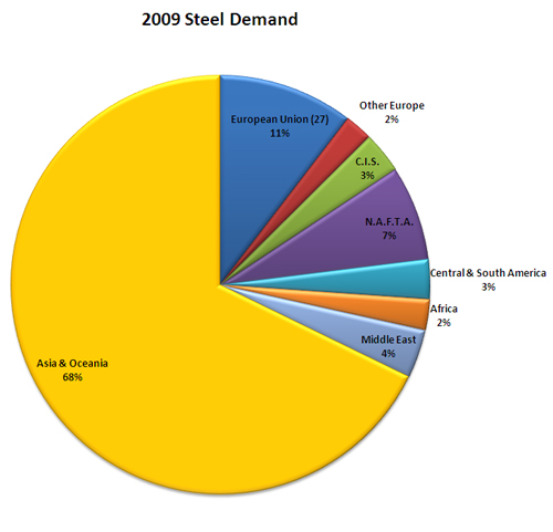
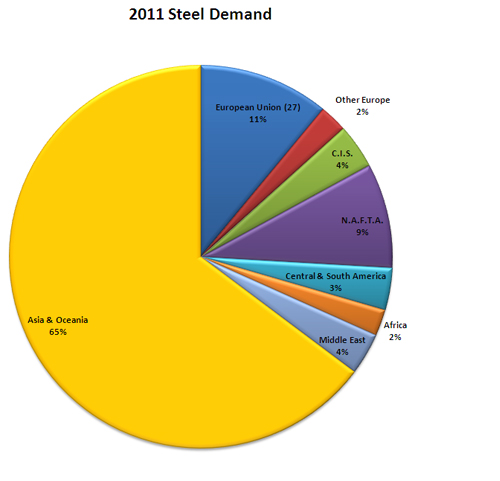
In October Worldsteel published a forecast of short term steel use. The folks at Nerds of Steel blogged about this shortly thereafter and shared the data on their blog. We found this information very interesting and wanted to graphically take a look at the shift in steel demand, so we dropped it into Excel to add a coat of paint and while the shifts are subtle, it is interesting to note where the changes are taking place.

While demand has risen across the board from 2009 to 2011’s projections (to the tune of 19.1 percent), the biggest areas of growth from a percentage standpoint are the former Soviet Republics (C.I.S.) and the Americas.

While data on the breakdown of these forecasts has not been released at a country level, we will aim to update this graphically when they become available.


